

Arthritis Consumer Experts
Arthritis Consumer Experts (ACE) is Canada’s largest national patient-led arthritis organization and leading provider of evidence-based education and strategic, sustained government advocacy. I've worked with them on multiple projects - one still ongoing: Walk10Blocks the App, Walk10Blocks.ca, GlobalRANetwork, and Arthritis BC & Me.
Arthritis BC & Me
The project: Arthritis BC & Me is a website that aims to connect patients who have arthritis with the research about the disease and researchers working on the disease.
The task: The main goal was to create a website that did not look or feel like a research website. One that would be friendly and usable to arthritis patients. I was brought on to provide general UX feedback and all of the UI elements/ style. At the time, the client had a handful of wireframes and a general idea of what their friendly website would be like. After I provided the UI and style elements, the web programmers built the website and all the widgets they needed.
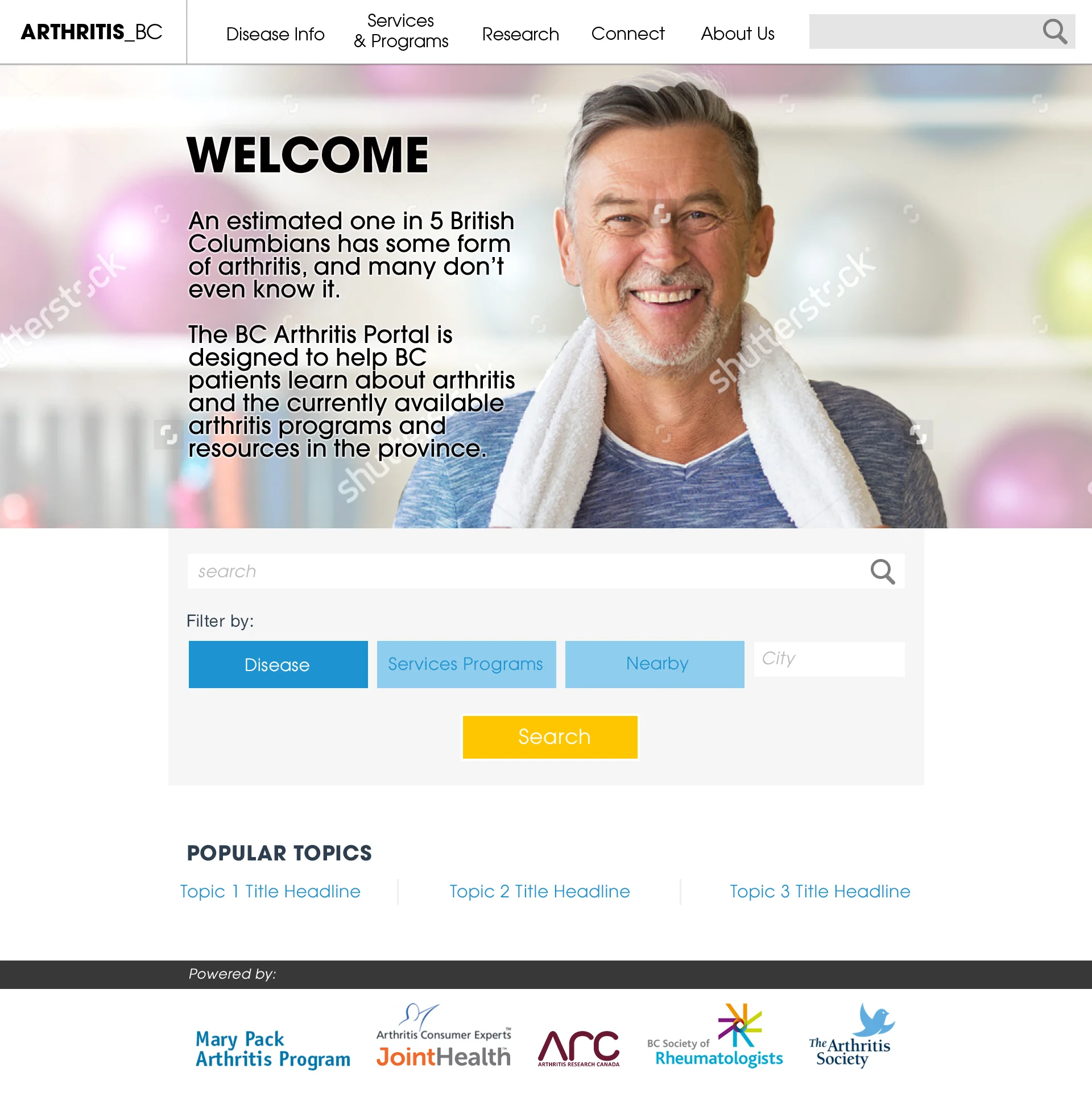
The Landing Page
One of the most important pages on the website (and any website) is the landing page. Our goal was to juggle the main feature - the search tool - with explanatory and welcome text for the website. Initially the welcome text was given prominence over the search tool.
I was handed the wireframe below to base the landing page design on.

Step 1: Landing Page Grey Box
Based on the wireframes (provided by the client), I mocked up a grey box design to help visualize the sizes of each element.

Step 2: Landing Page Options
Initially, the design included an intro summary of the website on the Landing page. We decided that the most important feature of the website, however, was the search tool, not the website summary.
Below are 3 nav bar options with different color, text, and search function treatment.


Once the nav bar treatment had been approved, the landing page welcome text had to be decided on. Below there are 2 layout options. Option 1had landing page text under the header image, Option 2 had landing page text on the image, with the search bar visible immediately from any device.

Step 3 - finalizing the chosen design
The option with the website intro information in the header image won out in the end, enabling the search bar to be visible from the instant the user lands on the website.

Other Screen Elements
There were a few key features that the client wanted to highlight on this website - new ways of presenting traditional information - such as a research link Filter Grid and an interactable infographic.
Filter Grid
On the Disease Info page there is a resource link filter, designed like a portfolio image gallery filter. Initially the design intention was to place solid white logos for each research organization on a solid color background. Unfortunately, not all logos were available to ACE or myself, and the low res, full color versions that we found did not translate well on the solid color blocks.


We opted instead to go with centered logos in solid grey outlines.

Hide/Show Information Box
In multiple sections on the website there are optional nuggets of long information. The client wanted the ability to hide and show entire chunks within a designated design. Most importantly, consistently across the site the collapsable text would be in a blue bounding box, thus easily recognizable.


Infographic
The “infographic” is a divided visual link map. Each medical professional title is a link to further information. Initially the design had medical professional icons per link, but it was quickly determined there were too many titles to map to an icon. Instead of focusing on the iconography, the emphasis is placed on the medical names.

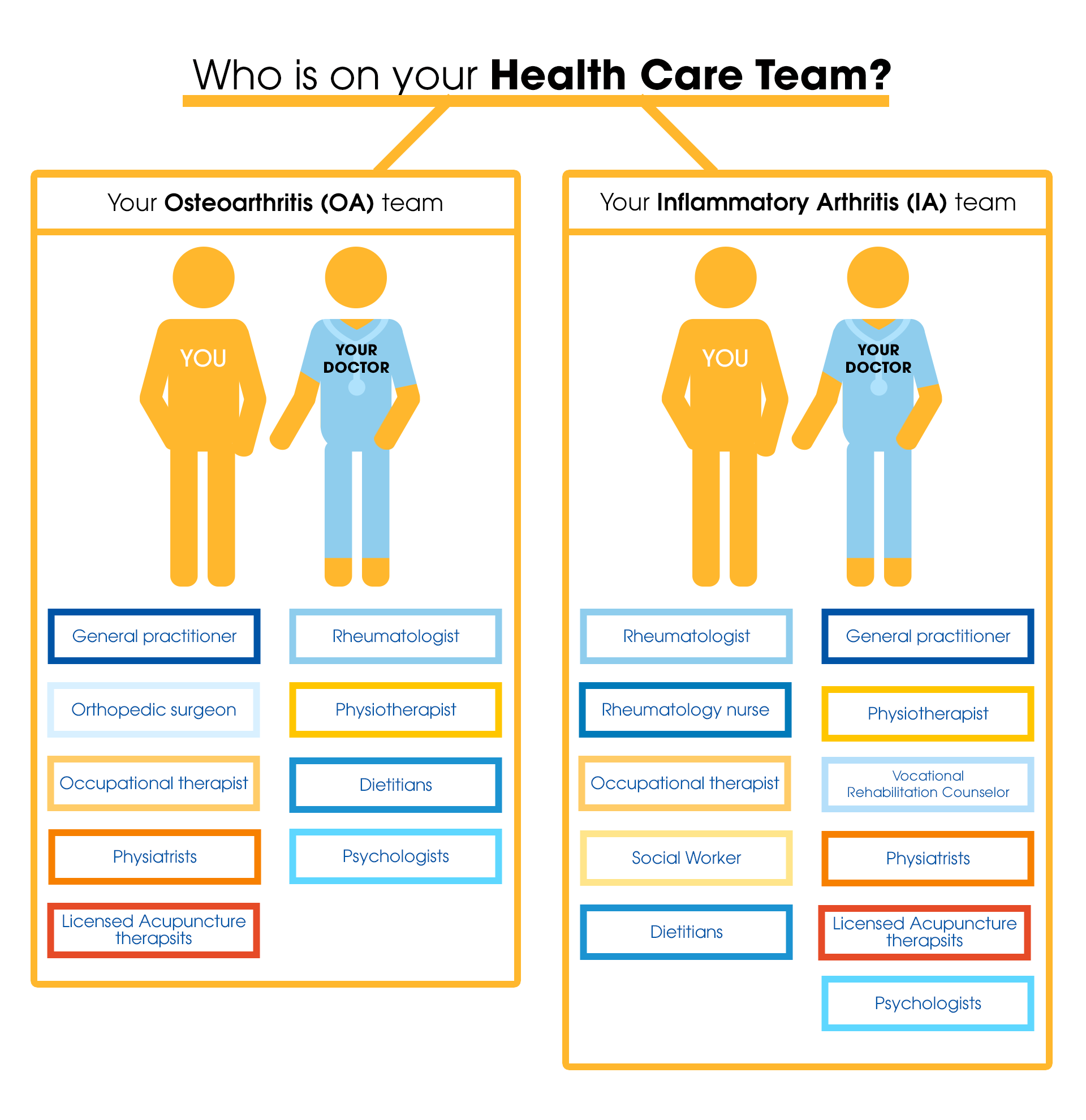


In the live and final version, the links open a popup with detailed information of what the medical professional does and how they help arthritis patients.

