

Madlands Mobile
Role: UX/UI Designer
Tagline: Mistakes in the past have left the world an apocalyptic ruin... but don’t panic, it’s not the end of the world! That already happened... How will you survive the Madlands?
Summary: Madlands Mobile is a FTP SLG set in a post-apocalyptic wasteland (a la Mad Max) where players build their bases, collect their heroes, and form alliances in order to survive and re-conquer the brave new world. I was brought on to the Madlands team two years into the game’s development in order to perform UX triage on the then-current design. The focus of my work would be to transform the game from vertical layout to horizontal layout, and update all the screens to a unified standard layout. Then to make the screen flow smoother and more logical.
Here are the two examples of the work I did on Madlands Mobile.
Alliance Profile
I was brought on to update the alliance profile in order to account for the new landscape orientation. The initial landscape design was implemented by the client programmer, and needed both updated UI and new UX.
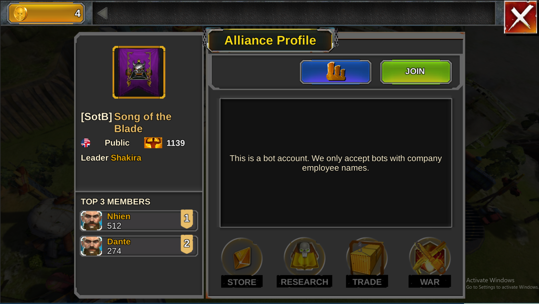
At the Beginning
When I started on this screen, this was the design as implemented by the client programmer. The task: to present all this information (and to determine what information needed to be shown at all) in a clear and easy manner.

At first, the major design changers were UI/ Icon based, with only a little layout shuffling. The 3D model was given prominence and the Alliance Buttons secondary importance.

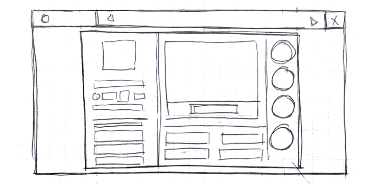
Step 1: Sketches
I started the redesign process by querying the game design team on the most important features of the Alliance Profile Screen. Then, using their feedback, sketched a number of designs to match the hierarchy.
We needed to display the vital Alliance information on the profile screen, while also juggling the interaction points and interaction types.
Alliance Profiles are integral parts of SLGs - the area where players create community and remain engaged with the game beyond the initial story. The profile needs to both entice players and provide them interaction points (Alliance Donation, Alliance War, Alliance Research, etc).


Flow Diagram
I also sketched up an flow diagram of how the user would access the Alliance Profile and what interaction points existed in the Alliance Profile.

Step 2: Grey Boxing
Once I had a set of sketches to work from, I took to photoshop to mock up a grey box version of the options. These grey boxes enabled the game team to visualize the feel of the new layouts.

Alternate Layouts


Step 3: Implementation
In order to execute on the design, I went into Unity and re-arranged the elements of the scene to match the leading grey-box design. The first round of execution lead to the team finding bugs and giving more detailed feedback.
A Temporary Change
Due to internal discussions, a new layout was proposed that broke the established game UX. To prove the concept I quickly mocked up the layout in Unity.
In the space where tabs would go, the Alliance Buttons are placed. This would confuse players, as in every other screen in the game buttons that appear on the right side are always tabs; changing the left side information but not navigating away from the Profile (which the Alliance Buttons would do).

After testing we decided to return to the chosen design.
Step 4: LIVE!
At long last, the screen is good to go.

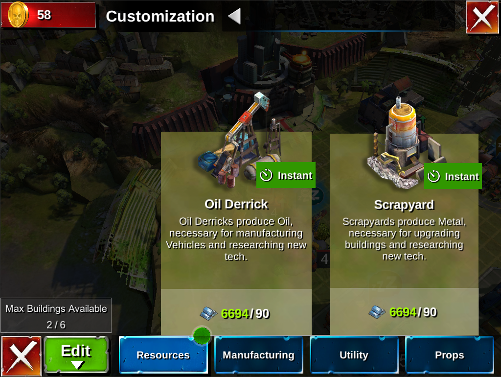
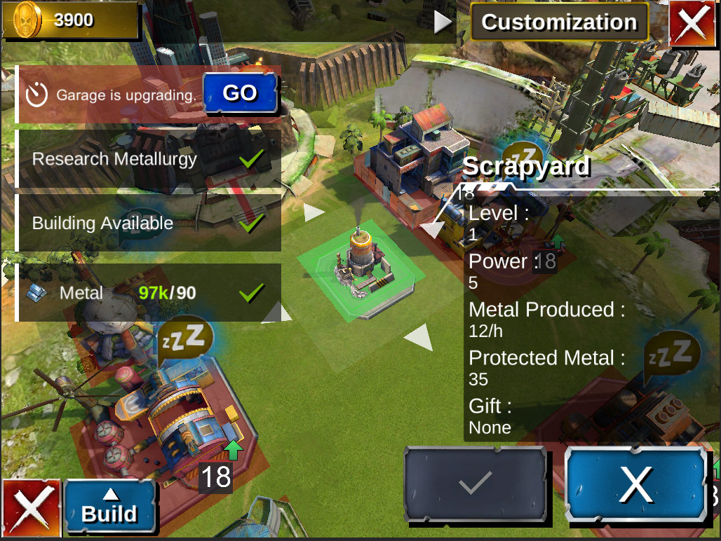
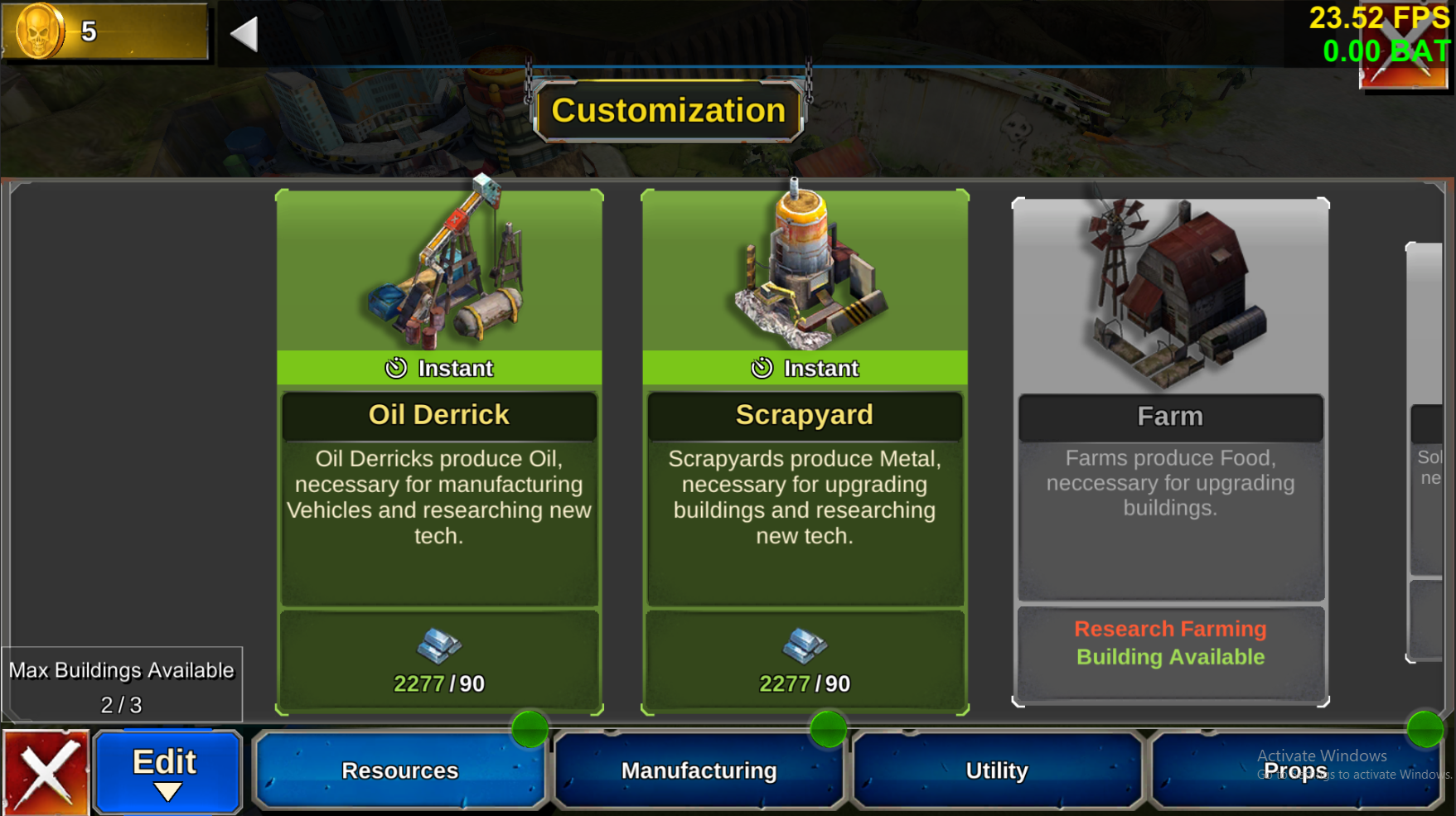
Base Builder
Unlike the Alliance Profile scene, the Base Builder tool did not exist prior to my hiring on the Madlands Team. However, it was initially implemented without a design by the client engineer. My job was to first skin the implementation and then redesign the base builder to match the rest of the game.
In The Beginning
As designed by the client engineer, the Base Builder came in two parts - the building selection screen and the placement screen. The problem with the placement screen began and ended with the floating information, covering the tiles of the base and blocking the movement of the user.
The base builder was initially re-skinned to match the game UI.

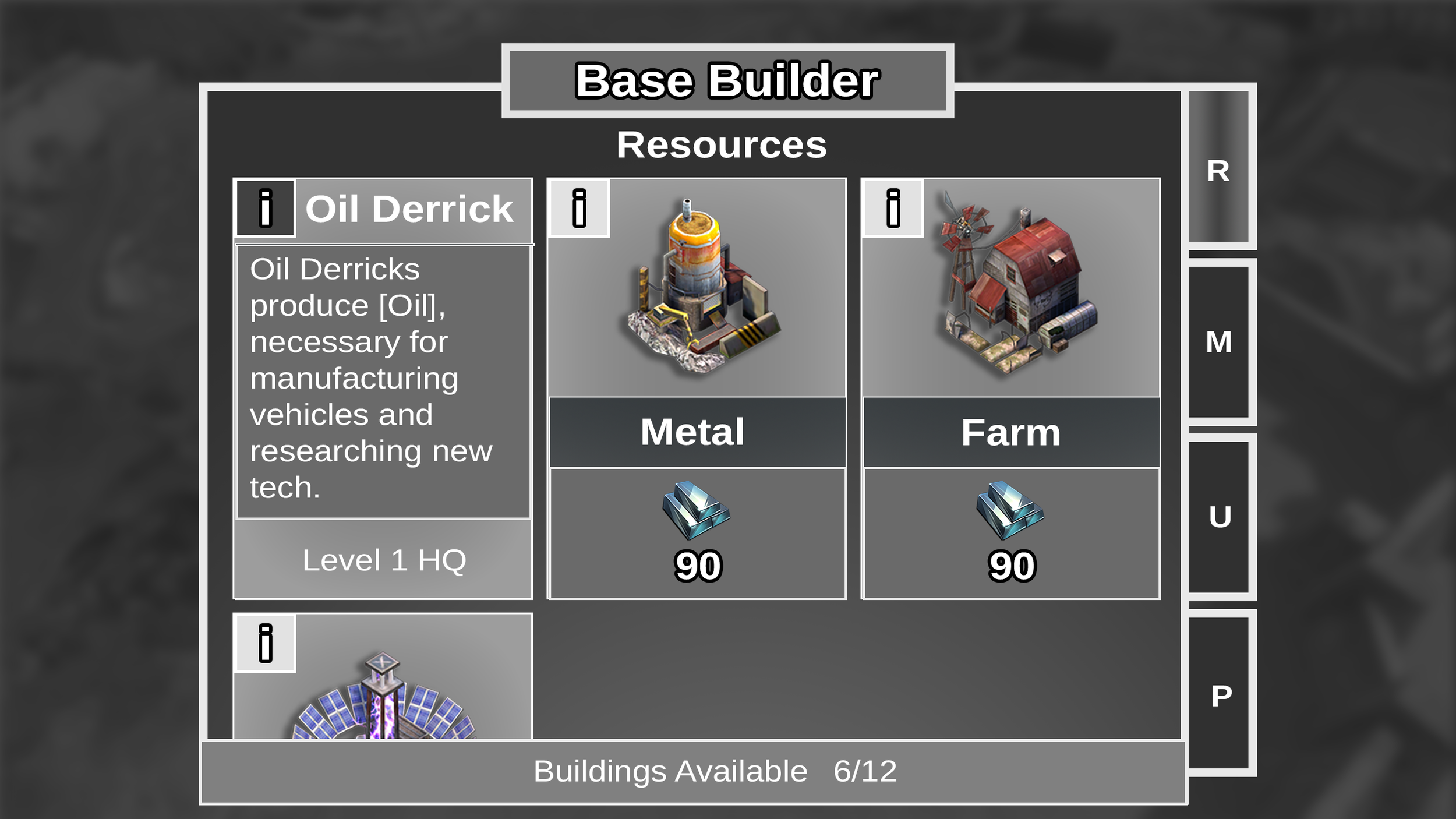
Step 1: Research
The base builder needed to fit the pattern of the game and also display its core information better. The redesign began with research into other base-related games, from Clash of Clans to Sim City BuildIt.
Step 2: Sketches
After reviewing the competitor game screenshots, I set out to make a fusion design - one that fit our current game design and information needs.

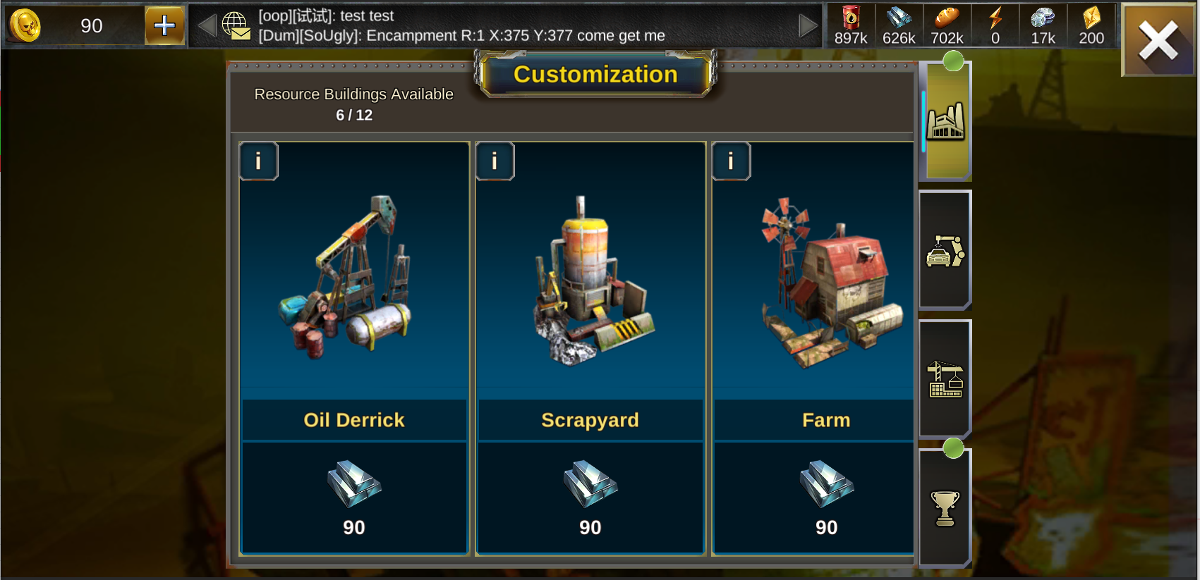
Step 3: Grey Box
The chosen redesign matched the other tabbed scenes in the game - notably the “inventory UI” - moving the tabs to the right hand side, pulling the building cards into the 4:3 bounding box, and removing the requirements/stats from the placement screen to the selection screen.


Alternate Layout Options


Step 4: Implementation
I implemented the redesign in Unity, requiring only marginal help from the UX programmer to fix linking bugs. Now the screen matches the rest of the game, and provides the necessary information up front.

TOP